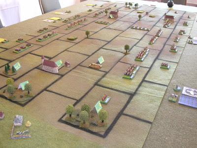
Among my various and sundry home-brew gaming abominations is my Baroque Battles system (pictured above) . This is a hybrid miniatures game that uses uses 6mm figures on a regulated (ie gridded) playing area. When I host games, someone invariably inquires about the game mat, which is the subject of this piece, dear reader. All shall be revealed. If you go to the Baroque Battles page of this blog (see the tabs across the top), you will find a pdf with these instructions that you can download. As usual, clix pix for BIG PIX.
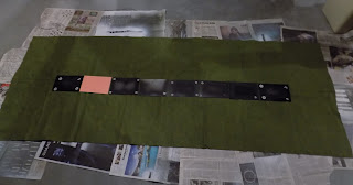
THE MATERIALS: The mat (at left) is a standard width (36”) piece of felt, obtainable from any fabric store. I had this cut to 8 feet. I also used some standard US letter-sized paper (card stock, heavier paper is better given the spray painting), a measuring device, spray paints, scissors, and a bunch of small weights, below (could be coins: I used washers mostly). Not pictured are the blow torch and bicycle pump, but since these aren’t needed--nevermind.
THE PROCESS:
First, you create the blanks for the grid. This is a highly technical
step. You take a sheet of paper (standard 8.5” x 11”) and cut it in
half (rendering two bits that are roughly 8.5” x 5.5”--see left hand
illustration below). Each bit now equals the size of a grid on the mat.
Then you repeat a bunch of times until you have lots and lots of them
(right below). Note: I re-used materials for this, hence the painted
bits you’ll see in these examples.
Next,
you lay down a long row of blanks in order to spot the maximum size of
your playing area (or you could do the math and measure it all up). At
this stage, getting the length is what you’re after. It doesn’t have to
be precise: err on the side of longer. There is a handy seam down the
center of the felt that you can use to center the blanks. With 8 blanks,
the playing area winds up being a neat 72 inches.
 Mask off the edges of the playing area This is where longer is better, so long as your grid fits inside this area.
Now take up your blanks (right) to expose your playing area.

Weigh down your pieces of paper so that they don't blow away when you spray paint (I learned this the hard way!).

Then go ahead and spray your ground effects...

This step will give you a nice clean edge between your playing area and the ends of your mat (the patterned area doesn't stand out very well in the photo, so I've highlighted the boundary with a dashed red line). If you enlarge the opening image at the top of this post you'll
get a good view of the effect.
Now you’re ready for the big step: laying out the grid pattern. Place your blanks starting with the center row and then moving towards the edges. You can see in the picture below how the grid pattern ends just inside the edge zones. The “brick” pattern replicates a hex grid, which is most versatile. You will wind up with seven rows: one in the center and three on each side. The last row on each side is half-sized, which hasn’t been a problem in play. In the picture, the layout is incomplete (I ran out of blanks), but you get the idea.
 I found that you can just eyeball the placement of your blanks. It’s not like laying tiles in your house where you must have absolutely regular spacing between the blanks (even the blanks themselves can be a bit irregular). The important thing is that the gaps are contiguous (in other words, the blanks should not overlap or touch; there should be always be a gap between them).
 The layout steps above will take care of the interior pattern. For the exterior...
...you’ll need to extend the pattern by one blank in each row beyond the edge of the grid, and then mask off the edge area. This will give you the exterior grid lines (left and right below)...

...then you weigh down all the paper (not pictured) and you're ready to spray paint, focusing on the gaps to create your pattern...
...And voila! Your mat is now complete. The close up below illustrates how the contiguous gaps between the blanks flow together in the grid pattern. You can also see that slightly irregular spacing doesn’t really cause an issue (as a matter of fact, it lends a sort of naturalistic look to the pattern). You can also see the half spaces on the edges.
The mat is ideal for use with two standard banquet tables.

I place a US Army blanket on the tables...
...and then I put the game mat down over that.
The playing area conforms nicely to the length of the tables....
...and there is space left on the edge for elbows, drinks, dice, references, etc...
Excelsior!


Wonderful job, an impressive table!
ReplyDeleteYour result looks quite good!
ReplyDeleteFor those that are too anal retentive to accept the variance between the templates, you could use some tile spacers to even out the placement of the templates. Like Ed, I sort of like them a touch variable. It gives it a more home-made look which I find appealing.
ReplyDeleteInteresting and I agree, I like it that they are not factory perfect. Looks fine that way.
ReplyDeleteI do a lot of To the Strongest rules and that uses a grid also but I do it like rules author Simon Miller suggests - simply make a pattern of small black dots in the squared pattern you wish. Again it doesn't need to be perfect.
What happens is in games where you don't need it, players don't even notice the dots once they get going. But when you are playing TtS, placing the troops within the dotted squares is simple.
Thus I can use the same felts for both squared battlefields and regular ones where we use rulers.
Hi Mike,
DeleteFortunately, this mat is single-purpose, so I don't have to worry about non-gridded use. On the reverse, I've got another grid, only smaller.
The next step I'm going to explore (on my list of many projects!) is irregular patterns (think of fields seen from the air). For that, I'm thinking of using a series of tiles that you would lay down (some bigger, some smaller, etc).
Simultaneous with that would be enough "standard" tiles so that I could replicate a regular pattern, but differ the geometry depending on the scenario. For instance, the first two rows on each side might be staggered (brick pattern), but the two in the middle might be "stacked"--this would create a head-on fight.
No fear here of running out of things to keep me interested if I join you in early retirement!